Map mural of the Bahamas Islands
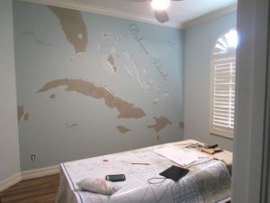
This week I did a map mural of the Bahamas.
My client is a pilot who flies people to the Bahamas and wanted a geographically correct map mural for his home office. We wanted something that still looks good in a residence, but also works well for his business. We chose subtle colors and focused on adding the airports and island names instead of mountains and terrain. That could have been a really nice mural as well, but in this case less is more.
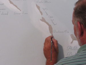
The painting of the islands and their positions was pretty easy. Labeling the islands, cities and airports took a bit of time. Cartography, the art of map making, is an art form itself, and we wanted to be true to that, but not so technically correct that it became too busy or confusing.
With a relatively simple background, the font and cleanliness of the letters became really important to me. Sloppy lettering, to me, draws the eye to the imperfections. Everyone notices a crooked letter of a messy handwriting.
We chose the colors off the furniture and floor colors to give the room a cohesive look. The shallow water color is the same color as the other 3 walls in the room. The land color is one of the colors from the wood floor. Other pops of color will come from their furnishings, which will allow the map mural to appear a bit more subtle and feel a part of the decor.
So this one was a bit time consuming. At first glance it appears simple, but the text, and doing it correctly was definitely worth it.

